Posted on

Could this be a sign?

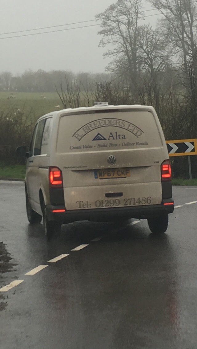
I’m easily annoyed. Perhaps it’s just my age. Or maybe there’s a lot to be annoyed about in the world right now. And I’m not just sweating the big stuff (Trump, war, Brexit…). Little things bug me too. Like signwriting on vans and lorries. I’ve written about it before but I feel compelled to write about it again after an angsty journey from my home in Shropshire to the Home Counties. Barely five miles into the trip I’m following this monstrosity.

I’m assuming the company has gone to the trouble and expense of having the vehicle signwritten as a mobile billboard. But adverts generally only tempt potential customers if those customers know what the bloody hell they’re being sold. It’s not clear at all from this mumbo jumbo what the van driver does for a living so I’m unlikely to stop him and buy one. Whatever one is.

It’s a classic case of trying to impress the reader with clever words and having exactly the opposite effect.

But as these two examples demonstrate is is possible to use the limited space and time available on the side of a moving vehicle to advertise one’s wares effectively.

The lesson? Decide what you want your words to achieve before you start writing and use language that is clear and concise to the reader.

Creating value, building trust and delivering results are bullshit bingoey kinds of words or phrases that should, like cliches, be avoided like the plague.

It’s all about the reader. If it doesn’t work for them it can’t work for you.

PS R Breeders Ltd, it turns out, sell bull semen.

Posted on

Striking the right tone – why conversational is best when writing for the web

The social web is supposed to be just that – social. So be sociable. Which, tonally, means writing in a conversational style. The best web copy is, in most circumstances, both chatty and purposeful.

In the old days when the majority of our social interactions were face-to-face our impression of an individual (or an organisation for that matter) was built up from these literal meetings. Rightly or wrongly we judged people from how they spoke, the words they used, the way they dressed. We even judged people instinctively. As I write this I can almost hear my granny saying “ooh don’t trust him his eyes are too close together.”

Well nowadays many transactions are happening online solely in a virtual sense and as a consequence our impression of the individuals and organisations we’re transacting with are derived to a significant extent (in some cases almost entirely) from the impression created by the website where those transactions are taking place.

So the big question is this: are your words creating the right impression?

Here’s a fun way of checking whether your website is creating the right impression. Look at the tone of your website from a user perspective and try to build up a mental picture of the person or people who’ve written the words. Now if you bumped into your organisation in the street what would he/ she be wearing? Suited and booted? Smart but casual? Or scruffy as hell? And how old would they be? Young or old?

We have a lot of delegates from local authorities attending our writing for the web workshops and after doing this exercise they realise that their tone is far too starchy and may well be putting off the very people they’re trying to help. “Male, middle-aged and wearing a grey suit,” they say. Not that there’s anything intrinsically wrong with that especially as I score two out of three on that count…

Work out the tone that you need to project to achieve your aims and objectives and then make sure the words on your website help do just that.

Of course it’s about a whole lot more than just words – things like the graphics and for those organisations with actual contact with their clients (whether by phone or face-to-face) how those interactions are handled. But all that’s for another day and another workshop. For example, our popular dealing with difficult people workshop.

Here are some examples of overly formal, downright pompous or simply stupid writing from the on and offline worlds.

“This item of gym equipment is currently out of service. We would like to take this opportunity to apologise to our customers for any inconvenience this might cause.”

We can see it’s broken. It’s covered with more hazard tape than a crime scene. Words that tell us what is plain to see are superfluous. Tell us something we don’t know. And I bet if we asked you face-to-face what was going on you wouldn’t speak in such a formal way: “I would like to take this opportunity…”

So make sure your words are chatty in tone, add value and get to the point quickly.

“We’ve called the engineer. Sorry!”

But shorter isn’t always better. Take the rather stark warning: “Do not litter!”

So commonplace a sign that we eventually become so used to seeing it that, in effect, we don’t see it at all. And, in any case, even if it adds “£50 penalty for offenders” we know the chances of getting caught are remote. So if the stick is ineffective enter the carrot…

“It costs you money to pick up litter.”

Or the softer version appealing to the heart instead of the head…

“Our workers risk their lives picking up your litter.”

Ask yourself what combination of words and tone is most likely to achieve your purpose. And make sure your words convey meaning clearly and concisely.

Here’s an exercise you can play when you’re stuck in a traffic jam or driving along a motorway…

Look at the signwriting on the sides of commercial vehicles, lorries and vans. During a recent trip to London down the M40 I saw “Sam’s Fried Chicken” and “Interior Contracting Solutions” within the space of a mile. I knew instantly what business Sam is in. He does exactly what it says on the van. But I’m still not sure what the other business is advertising. Both signs are three words long. One is clear. The other obtuse. Is your website a Sam or do you need the services of Website Clarification Solutions?

We’re all guilty of showing off in our use of language. Or at least I am. Trying to appear ever so erudite when it’d be a whole lot clearer if I used the word clever instead. Accidentally obfuscating – sorry I mean clouding/blurring/muddying/complicating/fogging – the issue when I’d be better off using one of the many more widely understood and/or shorter alternatives.

The beauty of English is that it has two roots – one Germanic the other Latin – and, therefore, an extraordinary lexicon/vocabulary to choose/select from. But it’s also a beast in that, confronted with a dazzling array of words (more than a million according to some studies) we can, if we’re not careful, end up choosing the wrong word and look silly instead of smart. I’m sure I’ve done exactly that somewhere in this article and that you’re just itching to tell me. I’ll make it easy for you just click here to send a fulminatory email.


This is an extract from Richard’s book Writing for the Web – why reading differently means writing differently. It’s available as a pdf, an e-reader and, coming soon, as a paperback. To order your sample copy please fill in and submit the form below.

Which version would you like?(required)

Continue reading Striking the right tone – why conversational is best when writing for the web

Posted on

How to stay in control of media interviews

Answering a journalist’s question is all very well when it’s a helpful question. But if it’s unhelpful, unanswerable or unwelcome, responding is often better than actually answering – providing you don’t sound evasive, ignorant or both. So in this short talk our lead media trainer, Richard Uridge, show you how to switch your interviews from a question and answer template to a question and response approach.

[powerpress]


This podcast episode is just one of a series of audio, video and written “how to” guides that form part of ACM Training’s Five Minute Masterclass series.

Posted on

How to start a presentation – “zoom in” on a detail

How to hook your audience at the start of your presentation by zooming in on a detail. It’s better, says ACM Training’s presentation skills coach, Richard Uridge, than overwhelming them with the “big picture.” Or boring them with something that looks and sounds the same as every other presentation they’ve ever seen.

[powerpress]


This podcast episode is just one of a series of audio, video and written “how to” guides that form part of ACM Training’s Five Minute Masterclass series.

Posted on

You’re a social media landlord – manage your property portfolio well

With a property portfolio at one stage of more than 1,000 homes, Britain’s biggest buy-to-let landlords must have found it difficult to keep tabs on every single property they (or the banks) owned. I find it hard enough to keep tabs on just one – the house I live in. So, almost inevitably, tucked away in an avenue here or a cul-de-sac there will have been buildings that dragged down the reputation of the neighbouring homes. Peeling paint. Broken windows. Leaking roofs.

And so it is with social media real estate. Long forgotten Facebook business pages which haven’t been updated since September. September 2014 that is.  Corporate Twitter accounts with fewer Tweets than an empty cuckoo’s nest. And LinkedIn profiles that are about effective a calling card as a phone number scribbled on a soggy beer mat. All “properties” that could be damaging your reputation.

So it’s time to do a social media audit to assess the extent of your digital estate. Demolish those Facebook accounts, pages and groups that are surplus to requirements. Bulldoze those Twitter accounts that were set up in a burst of enthusiasm for every single department. In short, rationalise.

And where your rationalisation reveals gaps in your digital portfolio get building. Construct a new Instagram account. Open that YouTube channel. Make WhatsApp ‘appen.

Now if you’ll allow me to push the metaphor a little further… don’t risk getting “locked out” of your own property by allowing your “tenants” to make their own keys. Open up social media accounts centrally and keep a register of the administrator usernames and passwords – yours and anybody else you grant administrator or similar rights to – so that if somebody leaves (even you) the organisation can still get in.

If your digital estate audit does reveal a Facebook business page that you’re locked out of, perhaps because it was set up by somebody who’s now left, getting it deleted without a username and/or password can be tricky. The best thing is to report it to Facebook. Here’s a useful post on Facebook’s own help pages.

There’s a chance that your search will reveal property that looks like yours but isn’t. For example, I’ve worked as a social media trainer with local authorities who’ve discovered several spoof pages or profiles set up by disgruntled council taxpayers purporting to be the council. In these cases there’s not much you can do. Most tend to have a short lifespan and fizzle out after the initial disgruntlement (is that even a word)!? dies down. If they persist you could try contacting the owner and resolve the issue by negotiation. If that doesn’t work, and in particular if the spoof content is offensive, you could again try report the issue to the relevant social network. But don’t hold your breath. Resolving problems through the official channels can be long-winded and may still fail. Which is why managing your digital property portfolio properly in the first place is vital.

Be a good landlord.


I have to thank my trainees at Melton Borough Council for proving the inspiration for this post. You can find them on Facebook. If they’ve done their audit properly there will only be one page!

*  I shot the feature image in Kampot, Cambodia while on holiday earlier this year. It’s a fine old building from the era before Pol Pot and his murderous regime. Unlike a disused Facebook page it’s former grandeur shines through the decay.

Posted on

Why First Person isn’t bad for science communication

Traditionally scientists have used the Third Person when communicating their work – particularly to fellow scientists. But in the cult-of-personality, social media age might the First Person be better? ACM Training’s lead media, communication and presentation coach, Richard Uridge, argues the case for scientists putting themselves centre stage.

Not so long ago science students were encouraged to write in the third person. “I did this” or “we observed that” first person communication was struck through with the bright red slash of a supervisor’s pen and replaced in spidery handwriting with “this was done” or “that observation was made.” Why? Because an aloof way of writing – and even of speaking – somehow reinforced a scientist’s sense of detachment from her or his research.  Get too close, put yourself at the heart of the experiment and you’ll compromise your independence or even corrupt your conclusions.  Or so the argument went.

Well after sitting through two days of presentations at a post graduate student event in Birnham, Perthshire, organised by the James Hutton Institute, I have to say it’s high time we overturned the archaic orthodoxy. The presentations that this, admittedly non-academic, member of the audience understood and enjoyed the most (and the two aren’t mutually exclusive) were those that unashamedly put the scientist centre stage. Being a part of your endeavours not apart from them isn’t bad science as anybody who’s been cured of a stomach ulcer (I speak from personal experience) ought to appreciate thanks to the pioneering work on Helicobacter pylori of Barry Marshall and Robin Warren. By drinking a bacterial brew to prove their theory (that it wasn’t spicy foods that caused gastritis) Marshall couldn’t have been more first person. And it certainly didn’t stop him and his colleague picking up a Nobel Prize.

The fact that the pair were plain speaking Australians helped. You can’t imagine Warren saying “a beaker of H. pylori was consumed and 48 hours later vomiting and fever were observed in the patient.” You can imagine him saying “Bazza chugged a tinny of the stuff and was crook as a dingo on dodgy dog food before you could say surf’s up. “

Okay so I’m exaggerating but you get my point: first person doesn’t equal bad science. And what’s more, first person does equal more effective communication. In short because it’s more engaging. Engaging an audience is a necessary precursor to communication. Think of engagement as opening up the pipeline between you, the scientist, and your audience. Once it’s open you can push information, data if you will,  through it from your brain to theirs. If the pipeline’s closed conveying that data is impossible.

Here’s the Who Goes First? podcast. It’s not about first person science communication per se but more about scientists who’ve experimented on themselves and are very much centre stage in the way I discuss above. It includes discussion of the ethical dimension of Marshall and Warren’s work.  [powerpress].

Please note that this programme was first broadcast on BBC Radio 4. As a result it contains copyright material so is strictly for personal use and must not be used for commercial gain withour our express permission in writing. Please contact me if you’d like to obtain a licence.


NEXT Rumours of its death may be greatly exaggerated but why PowerPoint is in intensive care and may not be the most appropriate tool for science communicators.

Posted on

Hook ’em with a question

“Online it’s all about the narrative. We’re suckers for a good story so try to convey your research as such. Make it engaging for your target audience. Aim for a conversational tone. And remember to ask lots of questions. Think of it this way: a question mark is like an upside down hook so to hook people into your research ask them questions. As a researcher you’ll be amazed at the value of their responses. It could even be the answer you’re looking for!

I penned these few words of advice for researchers looking to build an audience for their work online. It was in response to a request from Hywel Curtis at http://www.growresa.com – a new website to help academics with blogging.

The quote took me a long time* – certainly longer than the few minutes I’d expected. But it’s amazing how blogging can help clarify the thought process. And that, in itself, is surely one of the benefits of blogging for researchers? There are, of course, other benefits. Here’s a short presentation I prepared as part of a training course for Queen Margaret University in Scotland. It’s a basic introduction that I hope might help you decide whether to start blogging yourself. Watch it carefully and you’ll spot the delicious irony when I say that blogs shouldn’t be a repository for all those presentations you’ve given!


French philosopher Blaise Pascal

*The French philosopher Blaise Pascal, he of the “I’m sorry I wrote you such a long letter I didn’t have time to write a short one” was right; it takes longer to ponder a few sentences than it does to compose a whole article.


[products limit=”4″ columns=”4″ skus=”wpid=63,wpid=109″]

Posted on

What’s the difference between categories and tags?

Whether it’s birds or blogs we’ve be organising stuff into groups since the Swedish botanist Carl Linnaeus invented his system of classification. In fact I’d argue that making sense of our complicated world is something we’ve felt compelled to do as Homo sapiens (Kingdom: Animalia; Order: Primates; Family: Hominidae) pretty much from the get go. Or to put it another way, we were anoraks well before the anorak was invented. But whilst the taxonomy of the natural world is, for want of a better word, taxing, the taxonomy of the digital world is, thankfully, less complicated.

Carl_von_Linné

Blogs can be organised into three, simple sections:

  1. Subject
  2. Categories
  3. Tags

Think of the subject as the label that covers everything you write about or are planning to write about in your blog. It might be a subject with a wide-ranging scope like nature or gardening or something much narrower like hill walking or vegetable growing or narrower still like Munro-bagging or potato propagation. Narrow or wide the choice is yours – especially if you’re blogging for pleasure. If you’re blogging for profit then I’d suggest you stick to a subject you know about and one where your target audience will value your expertise. It’s easier to sell yourself a master of one trade rather than a Jack-of-all.

Categories become important once you have more than a few blog entries and  help vistors find their way around. The wider-ranging your blog the more important categories become. I have a client who blogs about urban anthropology (the subject). She’s written extensively about the legacy of the London Olympics but also writes about the post industrial landscape and about the impact of technology on human behaviour. I suggested they should be thought of and classified as three separate categories. Of course, there will be times when you want to list a post under several categories and that’s fine. For example, if Pokémon GO ever becomes an Olympic sport it’d come under two of my anthropologist’s category headings.

Tags are similar to but more specific than categories. Again looking at the example above a post could be categorised under “Olympic legacy” but be tagged specifically “London” or “Rio” so that a visitor could more easily find all the posts that are tagged or reference, say, “Rio.” Tags on blogs aren’t that different to tags on #Twitter that help us find stuff there.

Most if not all blogging platforms allow you to display your chosen categories so visitors can see your blog’s organisational structure at a glance. I’d suggest you do just that. WordPress and others also enable you to display the tags you use so that if a visitor clicks on a particular tag it aggregates all the posts that use that tag.

If you want to have a look at how I utilise categories click on the dropdown menu  on the sidebar of this post or on my personal blog. The tags I use appear along the bottom of this and other posts. Try out the feature by clicking on one.

Eat your heart out Linnaeus!


[products limit=”4″ columns=”4″ skus=”wpid=63,wpid=109″]

Posted on

Facebook groups versus pages

Should I set up a Facebook page or group?

Good question and the short answer in most cases is both!

The longer and more helpful answer is that it depends largely on what you’re trying to do (your organisational aims and objectives) and who you’re trying to do it with (your target audience). By answering the following questions you’ll be able to arrive at the best answer…

Which description best fits you and your organisation?

A: We’ve got a well-established support base on the social web and would simply like to split this existing audience into more manageable and natural subsets.

B: We need to get more likes and build a bigger audience in order to “sell” our products, services or ideas.

Answer A Then a group or groups is probably the best option for you.

Answer B Then a page is more likely the better option.

Do you want to keep the conversation between you and your audience private?

YES! Then a group is probably the best option because with closed or secret groups you can more easily manage who sees what’s being shared on the group’s timeline.  For example, with a secret group nobody outside the group can see it and, as a result, know who’s in it or what they post.

NO! You need to answer a few more questions yet. A page might be the best option but equally an open group could be the perfect solution.

Do you want to vet who’s allowed to join?

YES! Then a group is probably best. Group settings allow you to decide who you invite and/or accept.

NO! Then either a group set to anyone can join will be the right option or a page where anyone can like a page to connect with it and get updates in their news feed.

Do you want to use Facebook Insights to measure the results?

YES! Then go for a page because Insights doesn’t currently work with groups.

NO! Then it doesn’t matter which.

Do you need to share with your audience documents or files on your computer?

YES! Then go for the group option as it’s easier to share, collaborate and ask questions.

NO! Then again it doesn’t matter.


CASE STUDY – local authority

Victoria Fawcett of Stockton-on-Tees Borough Council set up a Facebook group called Stockton 5K trail series to promote, as the name suggests, a series of 5k runs across the North East of England. The group was fine as a way of communicating with athletes who’d already heard of the series from other sources – both on and offline. But it wasn’t so effective at growing that community to get more taking part in the events. Two things informed Victoria’s decision to set up a page and invite group members to join her there: firstly visibility – pages, she was told, are easier to find on Facebook than groups; secondly, because only a page gives you access to valuable metrics via the Facebook Insights suite of feedback and analysis tools.  Whilst the latter is true the former is not – unless your group is secret. The community page has nearly 1,500 likes (July 2016). That’s significantly more than were members of the now defunct group so it was clearly a good decision to make the change to page.

TOP TIP

Make an informed decision before you establish a page or group as you can’t automatically convert a group into a page or vice versa at a later stage. The only workaround in the case study above was for the group owner to ask members via the group timeline to migrate to the page incentivising those who make the journey across the wide open trails of cyberstockton by offering modest prizes (a beanie)!  Nor is it possible to merge two groups into one short of asking members of the one you’re closing to join the one you’re keeping going.

Think of pages as physical places. If you’re a small organisation you might only need one page/room. If you’re a big organisation you’ll probably need several pages/rooms. Get as many people coming through the doors of these pages/rooms as you can and then, once they’re in, decide how you want to organise them into separate groups.

CASE STUDY – national charity

As a supporter of the NSPCC you might like the charity’s Facebook ’s page. Almost 300,000 people already have. But it would be inappropriate for discussions about some of the grittier areas of the society’s work to be held, in effect, with all these people listening. So there are five open or public groups and who knows how many secret groups where like-minded individuals can get together in much smaller groups to discuss things. Social workers use these groups, for example, to discuss child welfare issues away from the public gaze. And young people can discuss growing up in a secret group away from the inappropriate gaze of adults.

TOP TIP

Ask yourself is it more appropriate for conversations with a target audience to be happening in relative if not absolute privacy? If the answer is yes then a Facebook group with its built in privacy settings is probably the best  for you.

CASE STUDY – small business

At ACM Training we had too many groups and it was almost impossible to find both the content and the time to post stuff to the various groups’ timelines to stimulate debate among members. For example, we had one group for people who’d been on our social media training courses and another for those who’d attended our writing for the web courses. Now we have a larger – but more easily managed – social web group which works for us because resources aren’t spread so thinly and works for group members (unless they think otherwise!) because there is a natural crossover between the two subject areas – if you’re interested in the social web you’re almost certainly going to be interested in writing for the web. We encourage group members to like our page but don’t insist on it as a precursor to joining the group. We also allow group members to invite new members so we can grow organically.

Here is a link to Facebook’s own thoughts on groups vs pages.

Posted on

Front loading – websites not washers

Here’s a quick and easy fix to make your website more appealing to your target audience:

Don’t bury the good stuff so far down the screen that people have to scroll or swipe to find it. Because they probably won’t!

To avoid this problem we have to “front-load” web pages – that is, put the most critical information at the top of the page where it’s clearly and immediately visible. In the old days of broadsheet newspapers it was called putting stuff  “above the fold” where, on a newsstand, the bit of the article on the top half of the front page could instantly be seen by potential buyers.

Front loading is such an important concept in my writing for the web workshops that I’ve devised some simple exercises to help explain it. The exercises also cover principles such as decluttering for clarity and brevity. It’s probably easier to print them off  (open pdf) and mark the paper, as I suggest, with a real red pen.

Here’s a paragraph written specifically for print that follows the conventional, and some would say out-dated, intro, explanation, conclusion format:

In this article I’m going to show you how to write for the web and explain why it’s different to writing for print. But first a little bit of history. Cast your mind back to school days.  Pound to a penny you learned to read in a linear fashion. For me it was Janet and John. And that’s still pretty much how we read books – word by word, from the top left to the bottom right of the page, page after page after page. But when we read stuff online we’re much less linear in our approach. Eye tracking studies suggest we scan the page in an F pattern searching for interesting or relevant information and read as few as 1 in 5 words. And if we don’t find what we’re looking for we leave the page or worse still the whole site in a hurry. The fickle way readers behave online is the biggest single factor determining the way we write web copy. In short, because people read differently we need to write differently. It really isn’t good enough simply re-purposing words written for paper. Or certainly not without wholesale changes in terms of structure, layout and length.  Structurally we need to write in such a way that the important stuff is placed on the screen where it’s clearly visible without the need for the user to scroll down. The principle is called top or front loading. Another name for the technique is the inverse pyramid. Doesn’t really matter what it’s called. We need to write in a way that lends itself to breaking up long paragraphs and, therefore, large blocks of text, into shorter paragraphs and smaller blocks, bullet points and lists. And we need to write in a way that is shorter, sharper and to the point because or readers tend to be less patient than when reading a book. [312 words]

Where is the introduction? Highlight it and write the number 1 in the margin alongside.

Where is the explanation or background? Put a number 2 next to it in the margin.

Highlight the conclusion (or conclusions) and mark with a 3.

Now try writing a version that conveys the same information but in the reverse order – 3, 2, 1. Start with the conclusion.

Struggling to find a natural sounding place for the introduction at the end? Another virtue of writing this way is that we can often dispense with the intro altogether and make the article shorter as a consequence.

Here’s my version.

People read differently online so we need to write differently. Put the important stuff at the top where it’s clearly visible without the need for the user to scroll down. The principle is called top or front loading or the inverted pyramid method. Break larger blocks of text into shorter blocks, bullet points and lists. Write in a way that is short, sharp and to the point. Why? Because eye tracking studies suggest we scan the page in an F pattern searching for interesting or relevant information and read as few as 1 in 5 words. And when we don’t find what we’re looking for we leave the page in a hurry. Compare that to the way we read words on paper. Cast your mind back to school days.  Pound to a penny you learned to read in a linear fashion. For me it was Janet and John. And that’s still pretty much how we read books – word by word, from the top left to the bottom right of the page, page after page after page. [176 words]

Better structurally but still a bit too long so let’s next go through it striking out the words that aren’t strictly necessary. See how short you can make the paragraph without rendering it meaningless.

Here’s my version, first with the editing showing and then without:

People read differently online so we need to write differently. Put the important stuff at the top where it’s clearly visible without the need for the user to scroll down scrolling. The principle is It’s called top or front loading. Break larger blocks of text into shorter blocks, bullet points and lists. Write in a way that is Be short, sharp and to the point. Why? Because eye tracking studies suggest we scan search the page in an F pattern searching for interesting or relevant information and read as few as 1 in 5 words. And when we don’t find what we’re looking for we leave the page in a hurry. Compare that to the linear way we read words on paper. Cast your mind back to school days.  Pound to a penny you learned to read in a linear fashion. For me it was Janet and John. And that’s still pretty much how we read books – word by word, from the top left to the bottom right of the page, page after page after page. 

People read differently online so we need to write differently. Put the important stuff at the top where it’s visible without scrolling. It’s called front loading. Break larger blocks of text into shorter blocks, bullet points and lists. Be short, sharp and to the point. Why? Because eye-tracking studies suggest we search the page in an F pattern and read as few as 1 in 5 words. And when we don’t find what we’re looking for we leave the page. Compare that to the linear way we read words on paper  – word by word, from the top left to the bottom right of the page. [106 words]

Shorter, certainly, but perhaps still a bit “slabby” in appearance. Try breaking it into bullet points and improve usability further by changing the font type, size and colour to make the key words stand out like headlines in a newspaper.

Read differently means write differently.

  • Put the important stuff at the top where it’s visible without scrolling. It’s called front loading.
  • Break larger blocks of text into shorter blocks, bullet points and lists.
  • Be short, sharp and to the point. 

Eye tracking studies suggest we search in an F pattern and read as few as 1 in 5 words. And when we don’t find what we’re looking for we leave. Compare that to the linear way we read word by word on paper. [83 words]

The shortest and cleanest-looking version yet, although maybe a bit too short for readers who are really interested in the subject. Extra detail can be provided through hyperlinks (internal or external) readily accessible to those who are motivated to learn more but without cluttering the page or confusing those who are only after an overview.

Here’s my shorter version with hyperlinks (and, yes, the hyperlink works)!

Read differently means write differently.

  • Put the important stuff at the top where it’s visible without scrolling. It’s called front loading.
  • Break larger blocks of text into shorter blocks, bullet points and lists.
  • Be short, sharp and to the point. 

Eye tracking studies suggest we search in an F pattern and read as few as 1 in 5 words. And when we don’t find what we’re looking for we leave. Compare that to the linear way we read word by word on paper. [83 words]

Now try the above exercises with a page or section from your own website. When you’re done road test it by asking your visitors  (or, failing that, colleagues, family or friends) which version they prefer. If your own website is too close to home to fiddle with without upsetting your co-workers then choose an external website from your sector that you think could do with a makeover.


This article first appeared in Richard’s writing for the web booklet which accompanies his training course of the same name. You can book a place here.