Posted on

Open County – Aran Isles

Approx. listening time: 23 minutes

Richard Uridge presented Open Country on BBC Radio Four for almost a decade. In this programme he visits the Aran Islands off the coast of County Clare in Ireland. Beware – you’ll want a Guinness after listening! This programme was first broadcast in March 2004.

Posted on

The world’s shortest social media policy (unless you can beat it)

the world's shortest social media policyThis is our social media policy at ACM Training. We’ve seen some longer ones in our time. Like the BBC’s social media policy where our social media trainer, Richard Uridge, used to work. He confesses he’s never read it. And that’s one of the problems with long and complicated policies. Nobody reads them when they really should. It’s a bit like the “mind the gap” warning on the railways. Short, sharp and to the point. Take too many words to say the same thing and people plunge to their (social media) deaths.

  • Point one above is about being purposeful. For profit or not-for-profit, you’re using social media to “sell” something.
  • Points two, three and four are, one way or another, about being mindful.
  • Point five is about being careful.
  • Point six is about being carefree (not mutually exclusive with the previous point)!
  • And the final point is a warning – both to individuals and organisations – that criminal, civil and even contractual law does or at least should or may apply.

So if you’re contemplating posting a picture of a cat that looks like Donald Trump to your Facebook page – don’t. That’s banned under rule one. And, come to think of it, the others too!


If you’re in the process of drawing up a social media policy for your organisation we’d love to help.

[products limit=”4″ columns=”4″ skus=”wpid=78″]

Posted on

In praise of social media content calendars and how they can save your professional life

I’m a big fan of diaries. Leather-bound analogue or online digital, they’ve saved my (personal) life more than once. Reminded me of children’s birthdays when there was still enough time to get presents. Helped me remember the exact day I met my wife so that the flowers arrived on the actual anniversary because a day late…well that bunch of tulips may as well have been Triffids. Stopped me missing the deadline to get those Christmas cards in the post to relatives Down Under.

And so content calendars can be (professional) life savers. Reminding us in plenty of time to plan and schedule content before it’s too late to post – not to Australia – but to LinkedIn, Facebook, Twitter and the other places we’re colonising as part of our social media empires.

A content calendar should be the number one tool in your social media tool kit. It helps you plan and schedule your content across the full range of your platforms in advance.

The sheer volume of content on the social web means it’s getting harder and harder for your content to stand out. And to make matters worse organic reach is in decline. So to tackle these twin challenges you need to generate creative content, schedule it well and consistently and boost it selectively as your budgets allow.

Consistent posting is one of the best ways to get more followers. Regular updates show potential followers you are, in fact, worth following. That they’ll be rewarded with fresh and interesting stuff – whether that stuff is pictures, videos or words (written in a blog post or spoken in a podcast).

A content calendar can you help you achieve this consistency across your platform mix by getting you into the habit of planning and scheduling in advance and not missing opportunities. I’m guilty – and I’m sure I’m not alone – of forgetting my Twitter feed, for example, and then playing catch up by posting heaps over a short period.

Finding the right content mix

The temptation is to use social simply to “sell.” Don’t! Many a sale has been lost by the seller being too pushy (think getting pounced on by an over-eager assistant the moment you walk into a shop). Pushy on social is understandable. After all, you’re putting a lot of time and effort into it and you want the best possible ROI. But, paradoxically, the harder you try to sell in an obvious way the less well you’re likely to do. Too much self-promotion can alienate your “customers.” The answer is to mix the explicit sales stuff with other content.

Eighty/twenty (80/20) is a good starting point. That is for every post that’s “selling” your product or service you make sure there are four posts that are helpful and interesting.

Another starting point is to use what’s called the rule of thirds. A third of your posts promote your business or generates leads. A third comes from other sources within your sector – on the understanding that your customers aren’t just interested in you and your company or organisation  but have wider interests. And a third of posts engage directly with followers – for example, by answering their questions, responding to their comments or posting user-generated content.

Whichever approach you adopt, over time you’ll discover the exact mix between these sources that works for your business. A content calendar will help you stick with the right mix.

The simplest content calendars are those that come with your computer, tablet or smartphone. Just jot down ideas as you get them. They might be timeless ideas or have a long long “shelf life” in the sense that it doesn’t really matter if they’re posted this week or next month. Others might be date-related – tied to a particular day or event such as national bring your dog to work day (yes, really)!

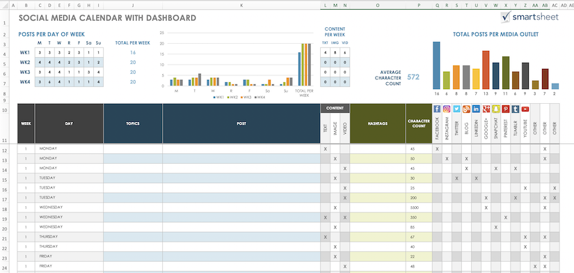
The more sophisticated calendars are spreadsheet based and can help you keep an eye on things like content quantity and network mix, with colour-coded pie charts and bar graphs. You can even add columns to assign work to colleagues or link to resources such as word documents, images and videos. Here’s one I’m road testing for a client courtesy of Smartsheet. It’s a free resource and seems pretty impressive so far, although I’ve only done a few miles so far so to speak.

Whatever calendar option you choose, encourage collaboration by sharing it via the cloud – unless it’s an old-fashioned wall planner which has the simple virtue of being seen by everybody who walks past it whether they want to or not.

Save time (and money)

You might think it’s a lot of faff filling in a content calendar and making sure it’s up to date. But used well it’s a time saver not a time waster. And the time you save can be re-invested in the all-important business of content creation. Remember content is king. Without good quality content and plenty of it you’re bound to fail!

Here are three other content calendar tips…

  1. Content calendars remind you to create platform-specific versions of your content to avoid posting exactly the same posts across multiple networks with the embarrassment of asking Facebook or LinkedIn followers to retweet. Uncool.
  2. Look back through the entries in your content calendar as well as forward. This way you can keep an eye out for content that’s  becoming too samey or repetitive whether that’s at a key message, target audience or content level, thematically (too many posts on the same subject) or over-reliant on the same words and images (too many puppy pics).
  3. Compare your content calendar with your analytics. Are there any patterns? Did a particular post do well? If there’s a spike in your visitor numbers on a Thursday what content might have created it and when? If you’re going to pay to boost certain posts it’s usually better to boost the best performing rather than waste money trying to breathe life into the worst. Your content calendar will enable you to spend your advertising budget wisely.

Finally here’s my content calendar entry for tomorrow: start blog post on quantity versus quality – why posting rubbish is drowning out the good stuff. And here’s my diary entry: order Christmas turkey.


[products limit=”4″ columns=”4″ skus=”wpid=78,wpid=63,wpid=109″]

Posted on

Social media for councillors

Should councillors here in the UK take a leaf out of the Donald Trump playbook and be on Twitter? Set up their own Facebook page? Start a YouTube channel? Post pictures to Instagram? Or, like me, write blogs?

The answer to all these questions should be, in my view, a resounding yes. Call me old-fashioned, but democracy, whether it’s national or local, works best when people know what decisions are being made on their behalf. When I first started as a cub reporter on the Reading Chronicle in the early 1980s, local newspapers had healthy circulations and could be relied on to report local government. But now that kind of local journalism has been emasculated, councils – and wider civic society – has to find other ways of keeping people informed. And one of those ways should be via the social web.

That said, doing so is not without risk. A lot of councillors I speak to – especially women – are reluctant to promote themselves and their vital work via Twitter in particular, because of an understandable fear of trolls. And that’s not the only barrier; many elected members are, to put it bluntly, getting on a bit and can find the technological and editorial challenges intimidating. It’s a generational thing!

But I firmly believe the positives outweigh the negatives. And with getting on for 40 million UK users of Facebook, not having anything to do with social media is a crazy as the councillor who decided to have nothing more to do with his local paper (the one I wrote for as it happens) and who lost his seat at the next election.

This presentation was part of a longer social media training session for Guildford Borough Council. I share it freely (with their permission and with the addition of a commentary) in the hope that other councillors or would-be councillors will be encouraged to have a go.

I should add that in the spirit of openness Guildford Borough Council webcast many of their training sessions including the one that this presentation was a part of. I think it’s fair to say that watching it via the web  isn’t quite the same as being in the room. But if you fancy a flavour of proceedings you can see them here. And, as you’ll quickly gather, I’m the grey-haired geezer at the front wearing a black shirt.


[products limit=”4″ columns=”4″ skus=”wpid=78,wpid=63,wpid=109″]

Posted on

Isn’t writing for the web just like any other writing?

Well yes and no. Yes because the web provides writers with just another medium for their words. No because web users read in a different way to readers of text in other media such as newspapers, books and magazines. They read in a much less linear fashion flitting across the screen like a butterfly looking for something to settle on. And when they do settle they tend not to hang around for long if there’s nothing of interest – not least because just a few clicks away there’s the whole of the World Wide Web to distract them. So as a web writer first you’ve got to grab your readers’ attention, then you’ve got to hold them long enough for your words to work their magic. And if that wasn’t hard enough you’ve got very little space to do it – especially if your words are displayed on a tablet or smartphone.

If I viewed the preceding paragraph on my iPhone in landscape mode, in a font large enough to read without straining my eyes (Calibri 11 if you’re a real anorak and want to check for yourself) I ’d get halfway through the seventh line before having to…


…scroll down. As a rule of thumb – an ancient expression that seems oddly modern in an age of handheld devices – you can squeeze 120 words on a Smartphone. Tablets, laptops and desktops can, of course, accommodate progressively more in one “screenful”. Read this on your iPad in landscape mode and you’d get about as far as the word anorak in the second paragraph – a word count of about 200. Turn the screen through 90 degrees and you can squeeze in an extra hundred or so words – 330 in total. A figure not to be scoffed at in a world where Twitter limits you to 280 characters but still relatively few compared to the olde worlde of paper and ink.

Take the book that’s been gathering dust under my bed for so long it’s now more dust than book. It’s called The Isles – A History by Norman Davies. It contains approximately 450 words per page – twice that between page turns given that you get to see two pages at a time. How do I know this? Because I am that anorak! What’s more I’ve just counted 2,750 words on a double page spread in the best-selling tabloid newspaper and 3,056 words on a similar two pager in a leading broadsheet.

I’m not saying people won’t scroll down. I’m just saying that these differences between screen and page demand much of us as writers. Certainly we shouldn’t be putting really important stuff so deep into a webpage that people have to scroll down to find it because they simply may not bother. To avoid this problem we have to “front-load” web pages – that is, put the most critical information at the top of the page where it’s clearly visible. In the old days of broadsheet newspapers it was called putting stuff “above the fold” where, on a news stand, the bit of the article on the top half of the front page could instantly be seen by potential buyers.

Authors have long been aware of the need to keep readers reading over the potentially awkward chapter breaks. That’s why they often set up some kind of conflict towards the end of one chapter but keep the resolution from us until the beginning of the next. Done well the book becomes unputdownable. The challenge then is to make our websites unclickawayfromable!


[products limit=”4″ columns=”4″ skus=”wpid=63,wpid=109″]

Posted on

FF sake – what musical notation can teach presenters and public speakers

Mozart was a dab hand at the piano. Which is putting it mildly. A veritable child prodigy, by the age of five he was already performing for royalty. And by the time he died – at just 35 – he’d written 600 works including his Piano Concerto 21 shown above.

I mention all this because more than 200 years later Mozart’s music has something to teach us as presenters and public speakers. He knew how to captivate an audience with high notes and low notes. Fast sections and slower, more reflective sections. Louder bits and quieter bits. In short, he scored his compositions in such a way that made them captivating. And I’d argue that you should score your presentations to make them captivating.

Far too many of the presentations I’ve had the misfortune of sitting through wash over me. Not because the content is dull (although it may be) but because the delivery is dull and as a consequence the content, however important, fails to register.

“Blah, blah, blah…

Nobody uses these exact words, of course. But they do use words that when spoken by the same voice, at the same pace and the same tone end up sounding so samey they may as well be.

“…blah, blah, blah.

The net effect of which is to send the audience to sleep. So how can we turn our presentations from unintended lullabies into stirring sonatas?

[product sku=”wpid=21″]

TEMPO

Well let’s start with tempo. You’ll see the word “andante” appears above the bar at the beginning of the sheet music at the top of this post. This notation of Italian origin is an instruction that the movement or passage should be played at a moderately slow tempo. If the whole concerto was to be played at the same tempo it’d sound much less impressive. It’s the juxtaposition of different tempos that make each stand out and contribute to the overall effect. And so it is with presentations. What bits of your presentation are best delivered allegro – that is fast? And which sections might best be delivered adagio – slowly?

VOLUME

Back to that sheet music you’ll see the letter “p” appears under a couple of notes. This means that the note should be played piano or softly. Two ps together as in pp means the note should be played pianissimo or very softly. It seems counterintuitive but if you want your audience to take notice of a really important point, saying it more quietly than your usual presentational volume (p or pp in musical terms) forces them to listen more carefully and helps reinforce the point. Although not if you’re too quiet – ppp!

At the opposite end of the dynamic range are the effs – f, ff and fff. F stands for forte or loud. FF for fortissimo or very loud. And FFF for fortississimo meaning very, very loud. I’d avoid fff altogether as it can seem really rude and shouty unless done for special effect, in which case it’s probably best to forewarn the audience or, at the very least, explain immediately after the very, very loud passage why it was so. And even ff should be used sparingly as it’s tiresome to listen to permanently loud speakers.

The knack is to vary the volume in a pleasant sounding and naturalistic way just as we do automatically in conversation. Think of your presentation coming to a crescendo – another musical term that means increasing or, literally, growing. Build to a major point or a call to action.

REST

Look carefully at the sheet music above and you’ll see what looks like a fat or bold hyphen at the end. This is what’s called a rest (actually it’s a half rest but let’s not get too technical – this is presentation skills not piano grade 8). A rest mark tells a musician to pause for a period of time to let the previous note die away. To echo into the distance. To be savoured to the very last decibel. And so you should pause for effect in your presentations. Carrying on before the audience has properly understood and appreciated your previous point is to cheapen that point. A tip here. A short pause for the audience can seem like an eternity for us presenters – especially if we’re nervous in which case silence can really spook us. So in order not to under do the pauses count to five in your head in one thousand chunks before moving on.

“One thousand. Two thousand. Three thousand. Four thousand. Five thousand.”

In summary, the human voice is a musical instrument. So play it like one. And if you feel the audience may be getting bored listening to the same old instrument playing the same old song can you change the instrument (if not the song)? By that I mean can you change the presenter? Most presentations tend to have just one voice (you) but can you recruit co-presenters and double-head or even triple-head your next speech? The simple expedient of a change of voice can keep an audience attentive for longer.

Forgive me for a final foray into this musical metaphor. Make sure your presentations are well orchestrated. Be a maestro. Just like Mozart. Aim for a bravura performance.


This post was first published as a podcast (complete with extracts from Mozart’s Piano Concerto 21) in ACM Training’s Five Minute Masterclass series. You can listen to the original there or below.

[powerpress]

Posted on

Could this be a sign?

I’m easily annoyed. Perhaps it’s just my age. Or maybe there’s a lot to be annoyed about in the world right now. And I’m not just sweating the big stuff (Trump, war, Brexit…). Little things bug me too. Like signwriting on vans and lorries. I’ve written about it before but I feel compelled to write about it again after an angsty journey from my home in Shropshire to the Home Counties. Barely five miles into the trip I’m following this monstrosity.

I’m assuming the company has gone to the trouble and expense of having the vehicle signwritten as a mobile billboard. But adverts generally only tempt potential customers if those customers know what the bloody hell they’re being sold. It’s not clear at all from this mumbo jumbo what the van driver does for a living so I’m unlikely to stop him and buy one. Whatever one is.

It’s a classic case of trying to impress the reader with clever words and having exactly the opposite effect.

But as these two examples demonstrate is is possible to use the limited space and time available on the side of a moving vehicle to advertise one’s wares effectively.

The lesson? Decide what you want your words to achieve before you start writing and use language that is clear and concise to the reader.

Creating value, building trust and delivering results are bullshit bingoey kinds of words or phrases that should, like cliches, be avoided like the plague.

It’s all about the reader. If it doesn’t work for them it can’t work for you.

PS R Breeders Ltd, it turns out, sell bull semen.

Posted on

Striking the right tone – why conversational is best when writing for the web

The social web is supposed to be just that – social. So be sociable. Which, tonally, means writing in a conversational style. The best web copy is, in most circumstances, both chatty and purposeful.

In the old days when the majority of our social interactions were face-to-face our impression of an individual (or an organisation for that matter) was built up from these literal meetings. Rightly or wrongly we judged people from how they spoke, the words they used, the way they dressed. We even judged people instinctively. As I write this I can almost hear my granny saying “ooh don’t trust him his eyes are too close together.”

Well nowadays many transactions are happening online solely in a virtual sense and as a consequence our impression of the individuals and organisations we’re transacting with are derived to a significant extent (in some cases almost entirely) from the impression created by the website where those transactions are taking place.

So the big question is this: are your words creating the right impression?

Here’s a fun way of checking whether your website is creating the right impression. Look at the tone of your website from a user perspective and try to build up a mental picture of the person or people who’ve written the words. Now if you bumped into your organisation in the street what would he/ she be wearing? Suited and booted? Smart but casual? Or scruffy as hell? And how old would they be? Young or old?

We have a lot of delegates from local authorities attending our writing for the web workshops and after doing this exercise they realise that their tone is far too starchy and may well be putting off the very people they’re trying to help. “Male, middle-aged and wearing a grey suit,” they say. Not that there’s anything intrinsically wrong with that especially as I score two out of three on that count…

Work out the tone that you need to project to achieve your aims and objectives and then make sure the words on your website help do just that.

Of course it’s about a whole lot more than just words – things like the graphics and for those organisations with actual contact with their clients (whether by phone or face-to-face) how those interactions are handled. But all that’s for another day and another workshop. For example, our popular dealing with difficult people workshop.

Here are some examples of overly formal, downright pompous or simply stupid writing from the on and offline worlds.

“This item of gym equipment is currently out of service. We would like to take this opportunity to apologise to our customers for any inconvenience this might cause.”

We can see it’s broken. It’s covered with more hazard tape than a crime scene. Words that tell us what is plain to see are superfluous. Tell us something we don’t know. And I bet if we asked you face-to-face what was going on you wouldn’t speak in such a formal way: “I would like to take this opportunity…”

So make sure your words are chatty in tone, add value and get to the point quickly.

“We’ve called the engineer. Sorry!”

But shorter isn’t always better. Take the rather stark warning: “Do not litter!”

So commonplace a sign that we eventually become so used to seeing it that, in effect, we don’t see it at all. And, in any case, even if it adds “£50 penalty for offenders” we know the chances of getting caught are remote. So if the stick is ineffective enter the carrot…

“It costs you money to pick up litter.”

Or the softer version appealing to the heart instead of the head…

“Our workers risk their lives picking up your litter.”

Ask yourself what combination of words and tone is most likely to achieve your purpose. And make sure your words convey meaning clearly and concisely.

Here’s an exercise you can play when you’re stuck in a traffic jam or driving along a motorway…

Look at the signwriting on the sides of commercial vehicles, lorries and vans. During a recent trip to London down the M40 I saw “Sam’s Fried Chicken” and “Interior Contracting Solutions” within the space of a mile. I knew instantly what business Sam is in. He does exactly what it says on the van. But I’m still not sure what the other business is advertising. Both signs are three words long. One is clear. The other obtuse. Is your website a Sam or do you need the services of Website Clarification Solutions?

We’re all guilty of showing off in our use of language. Or at least I am. Trying to appear ever so erudite when it’d be a whole lot clearer if I used the word clever instead. Accidentally obfuscating – sorry I mean clouding/blurring/muddying/complicating/fogging – the issue when I’d be better off using one of the many more widely understood and/or shorter alternatives.

The beauty of English is that it has two roots – one Germanic the other Latin – and, therefore, an extraordinary lexicon/vocabulary to choose/select from. But it’s also a beast in that, confronted with a dazzling array of words (more than a million according to some studies) we can, if we’re not careful, end up choosing the wrong word and look silly instead of smart. I’m sure I’ve done exactly that somewhere in this article and that you’re just itching to tell me. I’ll make it easy for you just click here to send a fulminatory email.


This is an extract from Richard’s book Writing for the Web – why reading differently means writing differently. It’s available as a pdf, an e-reader and, coming soon, as a paperback. To order your sample copy please fill in and submit the form below.

Which version would you like?(required)

Continue reading Striking the right tone – why conversational is best when writing for the web

Posted on

How to stay in control of media interviews

Answering a journalist’s question is all very well when it’s a helpful question. But if it’s unhelpful, unanswerable or unwelcome, responding is often better than actually answering – providing you don’t sound evasive, ignorant or both. So in this short talk our lead media trainer, Richard Uridge, show you how to switch your interviews from a question and answer template to a question and response approach.

[powerpress]


This podcast episode is just one of a series of audio, video and written “how to” guides that form part of ACM Training’s Five Minute Masterclass series.

Posted on

How to start a presentation – “zoom in” on a detail

How to hook your audience at the start of your presentation by zooming in on a detail. It’s better, says ACM Training’s presentation skills coach, Richard Uridge, than overwhelming them with the “big picture.” Or boring them with something that looks and sounds the same as every other presentation they’ve ever seen.

[powerpress]


This podcast episode is just one of a series of audio, video and written “how to” guides that form part of ACM Training’s Five Minute Masterclass series.